

11 December 2011

29 September 2011

Fabric/Lighting Assignment
1. Computer Lab
Digital Work
Ambient Lighting - Fluorescent tubes
Effect: Cool whitish light
-Visually cold but helps maintain colour accuracy from looking at lab monitors which are also cool
Velvet:
Lighting distorts colour
Doesn't help the red accents
Fabric Looks Brown
Rib Knit (yellow)
Bright
Appears more orange than yellow
Terry Cloth:
Blue/purple
Denim:
Very blue hue but vibrant
looks darker than naturally lit space; like studio
Recommendations
Warmer colour temp would be more inviting but might conflict with colour temp of computer monitors
variety in directional lighting, less overhead light
2. Tate Street Coffee
Task Lighting pendants
Also Flood lights
Effect:
Warm/inviting more so than fluorescent
Bright
Feels more intimate/cozy
Velvet:
Red hue has more vibrance
none of the accents are lost
Rib Knit (yellow):
More yellow/golden
Much warmer than lab
Terry Cloth:
Appears bluer
colour softer
Denim:
Not as rich blue
colour muted
natural looking
Recommendations:
Need more lighting over tables in middle
People preferred tables with better lighting
3. Parking Deck
High pressure sodium-Ambient Light
Effect:
Terrible colour rendering
washes out all colours
Velvet:
Appears borwn instead of red
Dark with all details washed out
Rib Knit (yellow):
Still yellow, lacks golden hue
still more consistent than others
Terry Cloth:
Washed out
Has a purplish tint
Denim: Also washed out
Recommendations:
Ceramic Metal Halide may preform better and render colour better.
Digital Work
Ambient Lighting - Fluorescent tubes
Effect: Cool whitish light
-Visually cold but helps maintain colour accuracy from looking at lab monitors which are also cool
Velvet:
Lighting distorts colour
Doesn't help the red accents
Fabric Looks Brown
Rib Knit (yellow)
Bright
Appears more orange than yellow
Terry Cloth:
Blue/purple
Denim:
Very blue hue but vibrant
looks darker than naturally lit space; like studio
Recommendations
Warmer colour temp would be more inviting but might conflict with colour temp of computer monitors
variety in directional lighting, less overhead light
2. Tate Street Coffee
Task Lighting pendants
Also Flood lights
Effect:
Warm/inviting more so than fluorescent
Bright
Feels more intimate/cozy
Velvet:
Red hue has more vibrance
none of the accents are lost
Rib Knit (yellow):
More yellow/golden
Much warmer than lab
Terry Cloth:
Appears bluer
colour softer
Denim:
Not as rich blue
colour muted
natural looking
Recommendations:
Need more lighting over tables in middle
People preferred tables with better lighting
3. Parking Deck
High pressure sodium-Ambient Light
Effect:
Terrible colour rendering
washes out all colours
Velvet:
Appears borwn instead of red
Dark with all details washed out
Rib Knit (yellow):
Still yellow, lacks golden hue
still more consistent than others
Terry Cloth:
Washed out
Has a purplish tint
Denim: Also washed out
Recommendations:
Ceramic Metal Halide may preform better and render colour better.
15 September 2011
Lighting Model
My groups light model opted to create a large space electrically lit with a series of can lamps which mimics the appearance of a night sky. The idea being that constellations could be formed by the lights to divide the space. The light cast by the the 'stars' produces a striking effect not just on the ceiling plane but when put under more intense light intricate shadows can be seen on the wall before ultimately diffusing further down, thereby drawing the eye.


07 April 2011
Group Marketing Packages
More graphic work this time around the work from a mock firm competition the third year students are entering. The students of Professional Practice had to produce a series of graphics for the students. I personally contributed with creating a graphic standard and most of the graphics that were produced for the actual project.
I stipulated, fonts, colours and layouts of the brand for the mock firms. The third year students will use these materials in May in Chicago for the actual competition.
The Actual branding document,
Flux 35 Branding Business
Bios of the mock firm's staff,
flux_35_bios
I stipulated, fonts, colours and layouts of the brand for the mock firms. The third year students will use these materials in May in Chicago for the actual competition.
The Actual branding document,
Flux 35 Branding Business
Bios of the mock firm's staff,
flux_35_bios
31 March 2011
Pro Practice Essay
Below is a copy of the essay I wrote for my pro practice lecture. It examines starchitecture and famous buildings and whether they truly fulfil the purpose of architecture or reflect poorly on the profession.
lahti_propracticeessay_310311
lahti_propracticeessay_310311
18 February 2011
Assignment 2.0 Personal Marketing Package
Having now handed in my personal marketing package to Travis for Professional practice, I suppose that I should post it here.
lahtiportfolio2011-2
We also had to produce a few other, documents like CV and a leave behind for actual interviews, however, these things have a lot of personal details on them and this being the internet, I think I may withhold them from my personal blog, maybe when I get an actual website up and running.
lahtiportfolio2011-2
We also had to produce a few other, documents like CV and a leave behind for actual interviews, however, these things have a lot of personal details on them and this being the internet, I think I may withhold them from my personal blog, maybe when I get an actual website up and running.
13 December 2010
Vance Chavis Library
So its been awhile, below you will find some details on my Autumn term project. The projects premise was a class wide project to come up with an idea for the tentative renovation of the Vance Chavis Branch of the Greensboro Public Library.
Ultimately the design culminated in a complete building redesign. Our class was divided into groups which, each designed a space within. My group was the atrium group and below are some of the things we came up with.
 Perspective looking South
 Perspective Looking East

Perspective Looking South West

Ultimately the design culminated in a complete building redesign. Our class was divided into groups which, each designed a space within. My group was the atrium group and below are some of the things we came up with.


Perspective Looking South West

04 October 2009
umm... England?
Right so George Quan is demanding I update this blog.. so here you go... Basically my summer was spent largely on the phone, in court rooms and in other countries so I dont have much to speak of when it comes to drawing... I do however have a ton of photos from various excursions in the UK presently... But first drawing I apologize for the poor quality I do not have a scanner and couldn't make it to the uni to scan in the lab today.. but I'll try to get in there some time this week..

I had a 6 hour layover in Boston on my way to Manchester and the terminal I was in had a gorgeous view of the Harbor so I tried sketching it...

This was just a quick perspective thing I was showing the year one students at a pub during a trip to the Cheshire Plain

Last week we went out to Rivington Pike and these are just some quick sketches as we were climbing the hill and I was falling behind so their quality is... not really very good but it was really just to get an idea.

Now since I've been here we've explored the Cheshire plain and Rivington Pike, the Pike being the actual site of our current project

This image comes from the Cheshire plain, its abit foggy, as expected but way off in the distance is Manchester more specifically you can just barely make out Beetham Tower Manchester's tallest building.


This is a tower at the top of the Pike, the pike is on the end of the Pennine Moors which divides the Eastern and Western parts of England. At one point the very hill was used as a stage of a beacon warning system to alert the English to an invasion by the Scots.. Just as a quick note, the view is allegedly second to none in England and on a clear day you can see Blackpool Tower and Liverpool Easily.. However the weather conspired against us and we could see only mist and more mist.. in fact at the top it was almost like being in the midst of a smoke screen as you could see absolutely nothing beyond the top of the hill.. Not really relevant but pretty funny... I've got a book to make for tuesday so I suppose I'll update again once thats finished..

I had a 6 hour layover in Boston on my way to Manchester and the terminal I was in had a gorgeous view of the Harbor so I tried sketching it...

This was just a quick perspective thing I was showing the year one students at a pub during a trip to the Cheshire Plain

Last week we went out to Rivington Pike and these are just some quick sketches as we were climbing the hill and I was falling behind so their quality is... not really very good but it was really just to get an idea.

Now since I've been here we've explored the Cheshire plain and Rivington Pike, the Pike being the actual site of our current project

This image comes from the Cheshire plain, its abit foggy, as expected but way off in the distance is Manchester more specifically you can just barely make out Beetham Tower Manchester's tallest building.

The view on our Asecent up Rivington Pike. Still rainy and misty as you can see...

This is a tower at the top of the Pike, the pike is on the end of the Pennine Moors which divides the Eastern and Western parts of England. At one point the very hill was used as a stage of a beacon warning system to alert the English to an invasion by the Scots.. Just as a quick note, the view is allegedly second to none in England and on a clear day you can see Blackpool Tower and Liverpool Easily.. However the weather conspired against us and we could see only mist and more mist.. in fact at the top it was almost like being in the midst of a smoke screen as you could see absolutely nothing beyond the top of the hill.. Not really relevant but pretty funny... I've got a book to make for tuesday so I suppose I'll update again once thats finished..
06 May 2009
The Storehouse: a hipster haven
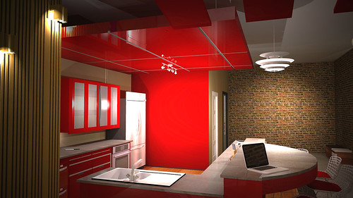
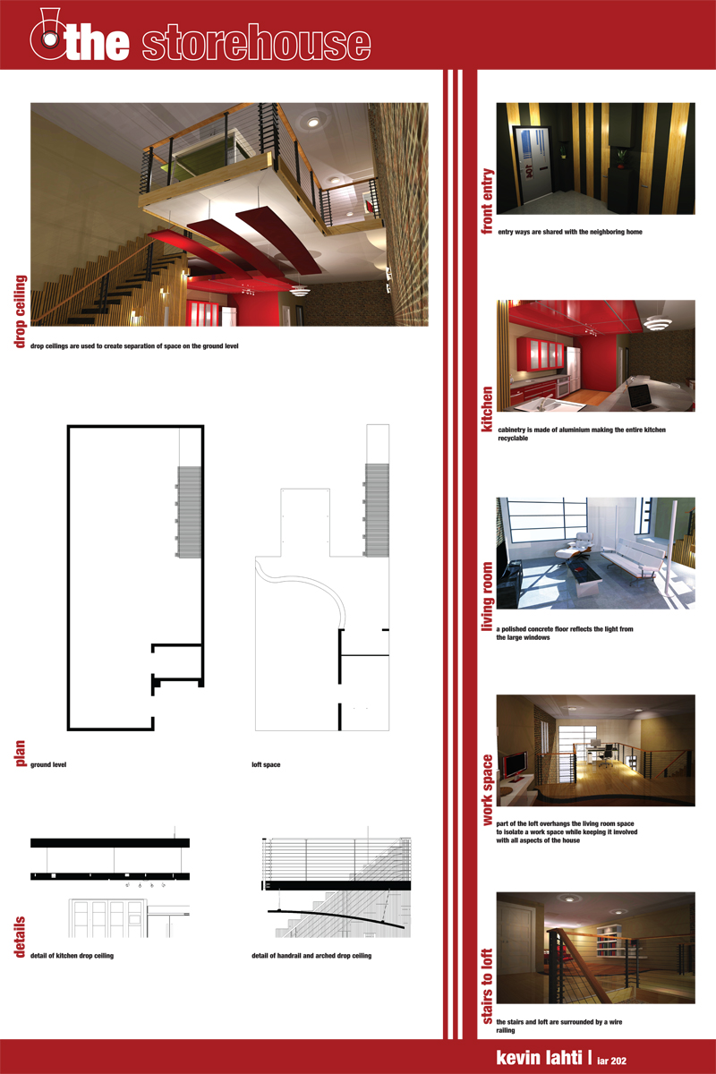
Our final project of Second year was to design a series of open loft homes using a univeristy owned warehouse. The homes had to fit in a footprint within 900 square feet and should feature sustainable ideas and materials. My design took to a very contemporary approach, with a loft I thought the best solution would be then to have very few walls sepearating spaces but I still wanted to give some kind of separation, so materials and textures were chosen to mark these changes. The floors were largely concrete with certain areas given bamboo flooring to mark out those spaces, this was noticable in the kitchen and in the loft if self. On the cieling drop cielings are used to show these changes in space with a large drop over the kitchen while 3 smaller arched cieling fixtures mark the transition into the living space. To mark leaving the public areas of the home the stairs use a series of 1x3" boards layered with each one alternating between a natural stain and a black paint.
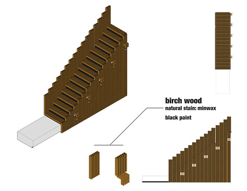
These stairs created a nice statement in the space they inhabited and gave good transition from the concrete metal and brick public spaces to the wood private space.
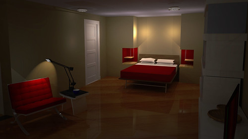
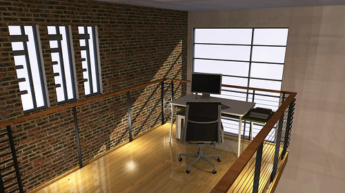
Upstairs in the loft their are two main sections the sleeping space and an outcrop which in this case has been designed as a home office. The outcrop was designed to seperate the occupant physically but still give them a connection as they can view all around them down into the public space or up in the loft space. It is both isolated and yet integrated with what is around it. the floors up here are made with bamboo flooring in two stains spice and natural.
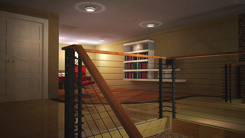
In order to keep the occupants from falling their is a railing going around the perimeter of the loft. The design of this sticks with the contemporary feel I was trying to establish and is very industrial, not to mention recyclable thanks to its aluminium construction.
06 March 2009
Celestial: A place to bathe

With spas and health clubs becoming increasing staples of contemporary society in addition to the growing universal design fundamentals it was only a matter of time until both ideas combined. This design is for a bathing space that can be used by both the able bodied and those who may be bound to wheelchairs. The space itself is divided, one being a more private pool with extra attention from attendants. This is designed for those who may need extra help, are embarrassed or simply seek a little privacy.
The larger pool located, opposite a partition wall is intended for 5 or 6 and also features accessibility to those in wheel chairs. However sitting in a pool in a wheel chair is hardly therapeutic and this space encourages one to leave the chair, to float or simply soak in the water.

Looking up towards the ceiling reveals a series of elevation changes marked with blue undersides, this form is an abstracted idea of water falling and encourages thought with its simplistic pattern.

Light is prevalent in this space with large windows allowing views to the outside but also allowing in much needed light which gives extra character to the space from the shadows cast.

The perspectives from the water may seem limited but they actually direct the view upwards either out the windows or towards the ceilings extrusions.

Attendants will be present at the bath to assist those in need of assistance but will also leave those seeking independence to do so at the guests discretion. With a single entry into the baths via the ramps it eliminates the implied segregation of those who are in wheel chairs and those who are not in addition the fact that the user leaves the wheelchair they may be bound to also removes that segregation.
Below are various drawings including the plan view, ceiling plan, wall section and elevation.


01 March 2009
A Place to dine

My most recent studio project was to create a place to dine in addition to the table present in the space. My table balances itself delicately on one leg. The room itself is very inspired by the bauhaus movements and the international style which I felt related to the tables design.
28 January 2009
Design Manifesto
Design to me as always been about creating something sculptural that attracts the people to it in some way and encourages thought. Much of my design also incorporates a playful use of light. My design attempts to evoke an emotion through its features, these emotions vary depending greatly on what aspect the design is observed. By using light I want to use it to create different effects, which can be reflected upon and are never quite the same. This way the design is constantly changing and constantly creating new emotions for people to experience. Through repetition I create a sense of uniformity but by adding minor differences to each they each gain individuality to better reflect the diversity of the world in which we inhabit. Whether or not my design succeeds is left to the individual but as of now this is what I pursue when I design.
-Kevin Lahti 28/01/2009
Inspiration:
Tadao Ando: Architect
Creates monumental buildings and sculpts the spaces within them and also uses light to emphasize areas. Few erroneous details, all things serve a purpose either aesthetically or structurally, no one element may be removed and have the same emotion left.
Jonathan Ive: designer of the ipod
Elegant sculpture that maintains function in all aspects, nothing erroneous. A uniform device that is individualized by the user. Not well known but product is used everywhere and is one of the most recognizable items in the world.
-Kevin Lahti 28/01/2009
Inspiration:
Tadao Ando: Architect
Creates monumental buildings and sculpts the spaces within them and also uses light to emphasize areas. Few erroneous details, all things serve a purpose either aesthetically or structurally, no one element may be removed and have the same emotion left.
Jonathan Ive: designer of the ipod
Elegant sculpture that maintains function in all aspects, nothing erroneous. A uniform device that is individualized by the user. Not well known but product is used everywhere and is one of the most recognizable items in the world.
03 December 2008
Shelter|Bus an Unabridged Legacy

I realized that as we advance as a society our dependence on technology increases. So much so that every 2 years the amount of data stored on computers doubles. A frightening statistic, it means that in the near future this dependence will cause the community to deteriorate due to our increased introvertedness.
I decided then that the bus would need to serve as a gathering point while at the same time incorporating advanced technology to aid in the recovery process.
The Lack of light pollution in Eastern NC, provides a unique ability to see stars. When grouped together these stars form constellations. Just as constellations find geographic points within the sky, the facial recognition software within my shelter bus is able to locate missing persons.
Movement is inspired by my precedent the TGV 001 High speed locomotive found in France. In order to ease navigation through the space way finding has been implemented with the use of an LED powered lighting system that transitions from Green to orange as they go from public to private. In order to mark the entry ways to the Communications Kiosks and the Missing Person Location system are marked with a blue LED lights as well as a woven wall.
Along with the aforementioned facial recognition software this public area communication devices allow the user to communicate with family members, doctors, or anyone necessary via webcam, email and phone.


The computer within the private area allows the user to adjust the environment to suit their needs. Whether by making the glass opaque so lynn can pray or transparent so that Chi Chi’s bird Col. Clucker can be seen. Similarly to the contemporary computer photos, videos and music can be uploaded to the computer. By simply touching a photo similarly stored images can be accessed.


What I have just done is walked you through some of the major points of my design from the macro to the micro. This same principle is the over arching idea within my shelter bus where communication occurs on a micro and macro level.
Some Details of various bus features


30 October 2008
Below are the images from the Bus|Shelter project. Our design focused around a tai chi position called snake creeps down. The design took on a more direct approach to the sprituality of tai chi. This design has 3 different degrees of spirituality with the greatest set in the enclosed space on the very end. Although ultimately deemed to have a number of concerns with construction the form itself was widely liked. Lights within the glass panes lit up the space to allow for a bit more safety and one pane of glass was decided to be used to display valuable information related to the bus system of greensboro.


10 October 2008
Bus|Shelter
Having concluded the latest charette in our bus|shelter and shelter|bus community design project. I present to you my bus shelter from start to finish. Given my site out side the weatherspoon art gallery I knew I immediately wanted it to relate and therefore I thought it should be sculptural, this led to a series of forms which I played around with.


I was inspired by the architect Tadao Ando who uses concrete and light to create interesting effects using a very minute amount of material, I came to the conclusion that I would use concrete while using light as a focal point of some kind. Taking inspiration from the Ectasy of St. Teresa by Bernini I found a phenomena of light called Zodical Light in which a wash of light goes up into the sky to a very fine point. I decided that this would be the effect that would recreate with my design.


With my concept and ideas I began to build my model


As you can see I took a very modern approach with a bit of minimalism as I wanted the form really to be what attracted the people. On the interior of the triangular wall are a series of glass prisms that will reflect the light and recreate the effect of the Zodiacal light.

These details illustrate a few of the minor details but are important none the less. One shows how the shelter is secured so it will not collapse or fall over the other shows how to keep the glass protected from the concretes expanding and contracting in tempreture changes.
Finally I prepared a contextual illustration of the bus shelter as it should appear in its site.


I was inspired by the architect Tadao Ando who uses concrete and light to create interesting effects using a very minute amount of material, I came to the conclusion that I would use concrete while using light as a focal point of some kind. Taking inspiration from the Ectasy of St. Teresa by Bernini I found a phenomena of light called Zodical Light in which a wash of light goes up into the sky to a very fine point. I decided that this would be the effect that would recreate with my design.


With my concept and ideas I began to build my model
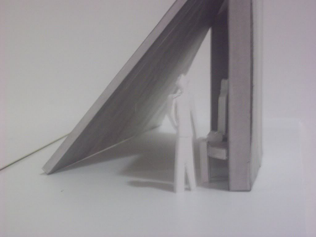
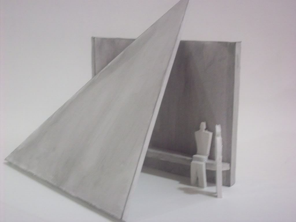
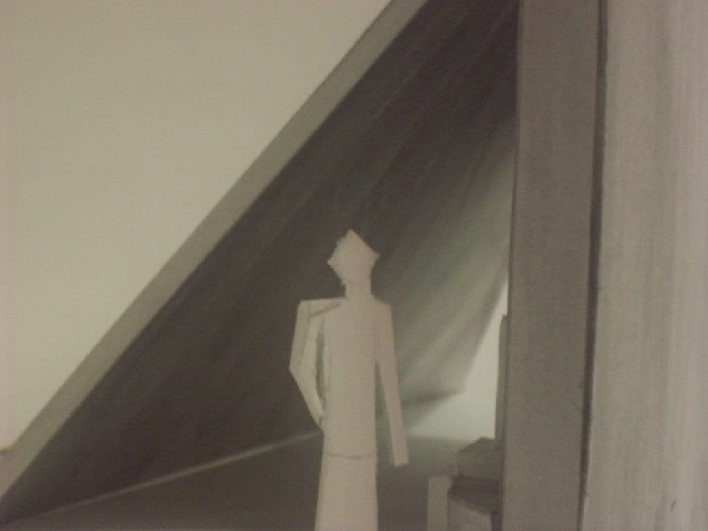
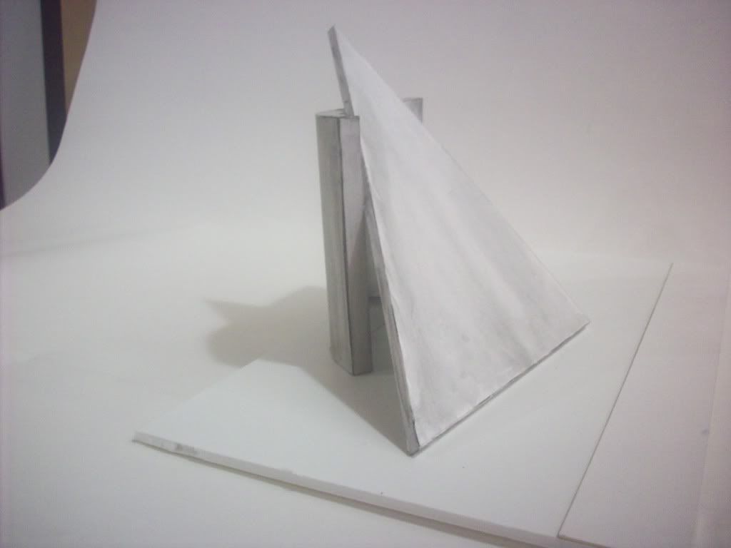
As you can see I took a very modern approach with a bit of minimalism as I wanted the form really to be what attracted the people. On the interior of the triangular wall are a series of glass prisms that will reflect the light and recreate the effect of the Zodiacal light.

These details illustrate a few of the minor details but are important none the less. One shows how the shelter is secured so it will not collapse or fall over the other shows how to keep the glass protected from the concretes expanding and contracting in tempreture changes.
Finally I prepared a contextual illustration of the bus shelter as it should appear in its site.

Subscribe to:
Posts (Atom)