Showing posts with label Design Research. Show all posts

10 October 2008

Bus|Shelter

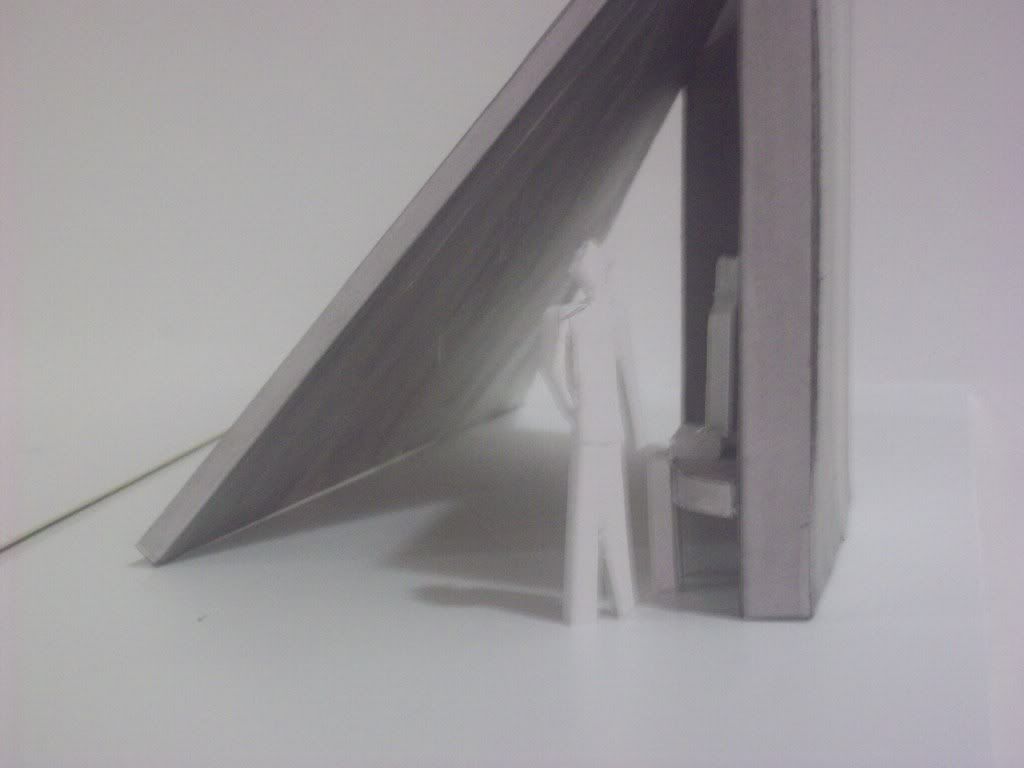
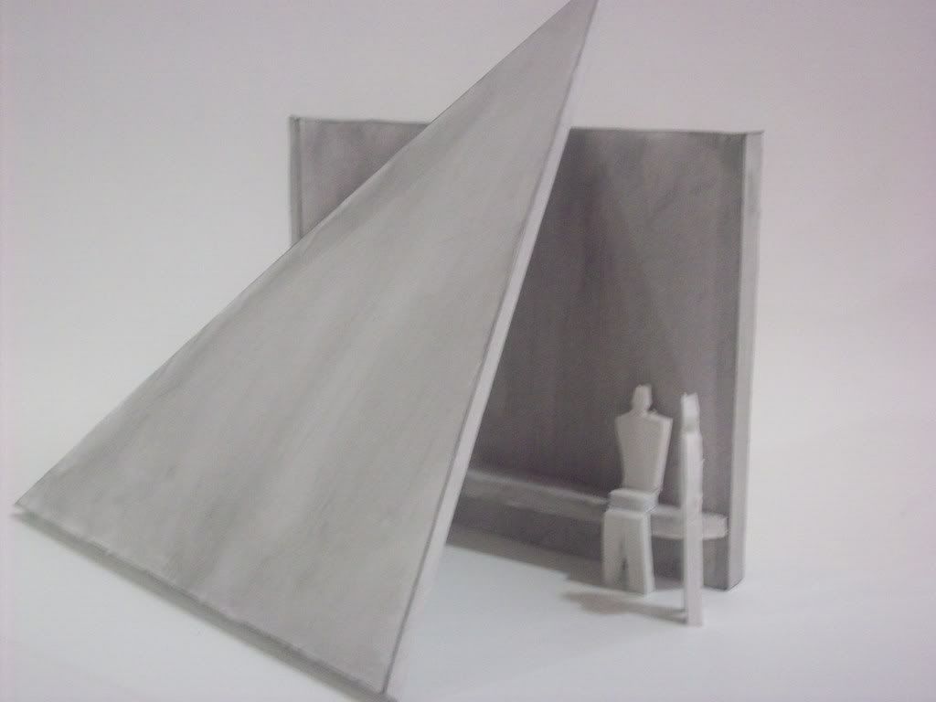
Having concluded the latest charette in our bus|shelter and shelter|bus community design project. I present to you my bus shelter from start to finish. Given my site out side the weatherspoon art gallery I knew I immediately wanted it to relate and therefore I thought it should be sculptural, this led to a series of forms which I played around with.


I was inspired by the architect Tadao Ando who uses concrete and light to create interesting effects using a very minute amount of material, I came to the conclusion that I would use concrete while using light as a focal point of some kind. Taking inspiration from the Ectasy of St. Teresa by Bernini I found a phenomena of light called Zodical Light in which a wash of light goes up into the sky to a very fine point. I decided that this would be the effect that would recreate with my design.


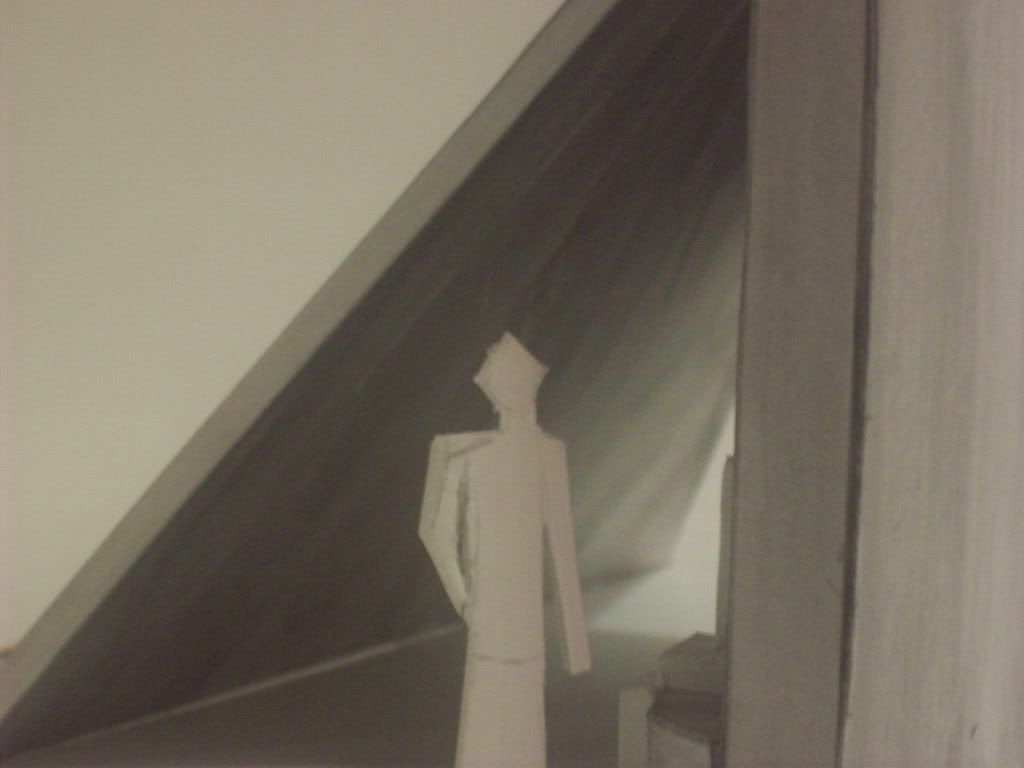
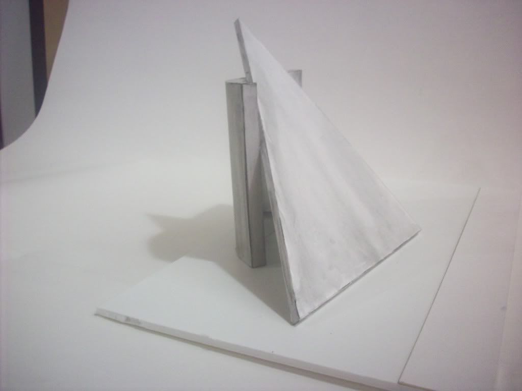
With my concept and ideas I began to build my model


As you can see I took a very modern approach with a bit of minimalism as I wanted the form really to be what attracted the people. On the interior of the triangular wall are a series of glass prisms that will reflect the light and recreate the effect of the Zodiacal light.


These details illustrate a few of the minor details but are important none the less. One shows how the shelter is secured so it will not collapse or fall over the other shows how to keep the glass protected from the concretes expanding and contracting in tempreture changes.

Finally I prepared a contextual illustration of the bus shelter as it should appear in its site.

17 September 2008

Container Charette

My Group decided to focus for our charette for a shelter bus on shelter and Medical Care. I was more interested in the Medical Care aspect so I was really involved in that design. We selected a bus made by Motor Coach Industries due to its size and various modifications they allow to be preformed while the bus is actually being produced. Below are some renders and photographs of some of the work of this charette.


Our idea focuses on literally a mobile hospital complete with triage, phramacy, couciling, an ambulance and even an operating room.


A break down of the space from a plan view, the operating room is in the back and is located near the medicines of the pharmacy, this operating theatre is designed for common surgical procedures.


A perspective view of the operating theatre.


Since we anticipate that people will likely need access to counciling we added a design for a councilng center and doctors private office so that, doctors may have a space for administrative duties but will also have a private place where a counselor may help those who need counseling get the help they need.


A side view of the bus shows the division of the surgical section from the office.


An idea we enjoyed was the idea that their should be some kind of vehicle that could be dispatched to retrieve those people who were unable to make it to the bus. We were able to actually find a bus that had enough space to store a small vehicle as well as the tents needed to set up the recovery and triage area


The bus/hospital after everything is set up, the tent on the right represents a recovery and triage area where a multitude of paitients can be kept until they can be released. The Bus takes on a headquarters roles in a disaster situation in which only the major operations need take place while giving the resources to the doctors and nurses who work to help those who need it.


A plan view of the entire complex once fully set up, this sketch was actually a jumping off point for the whole unit. Heather Link worked with me on the medical bus and she has some more information present on our design on her blog.

Our second bus was literally catering to sheltering victims of a hurricane and that information can be found at Katie Reynolds blog as well as Kara Petrisko's blog.


15 September 2008

Kings Group Charette Interviews


The interviews from the charette started on friday

As apart of our research for the bus/shelter client charrette we were sent out to get the opinion that matters the most. The city bus riders. Our group set out for the nearest GTA bus stop and when we got on we asked the lady sitting next to us if we could interview her. She said "yes." but she wished to remain anonymous. Thinking she was about to get off at the next stop, Kara quickly sketched her. She had short gray hair, glasses, and appeared to been in her sixies. We found out that she rides the bus everyday to and from her job as a Gulford County School teacher. She said it takes a about an hour of waiting and riding the bus every morning. At first she seemed a little shy, but as the ride she opened up a little bit and started talking about her children. When it was time for her to get off we thanked her for her time and went on our way to the depot.

10 December 2007

International Design Journals

It just wouldnt be design if there weren't some kind of Italian journal somewhere in here. Italy has always been seen as the in place when it comes to design and architecture. The journal Domus seems to take this idea to heart and domus tends to focus alot on up and coming trends most of which are arriving out of Italy. It covers everything from architecture, to jewelry design. Unlike some journals which may come across as being a bit full of their home country, (especially true in american publications) Domus keeps a good non bias and will cover just about anything. Even still I would classify it as "Italian Design & Architecture" I separate the two out simply because of the sheer number of aspects of design it discusses.

Archithese a German design publication made in Germany. Not to stereotype but this magazine really strikes me as following in its Prussian footsteps. Germany has always been seen as a very organized and to the point country and this design publication is really no different in terms of organization. The articles themselves are printed only in German so I had to do a fair bit of translating to understand (I speak German but it's been awhile). the context of what they discuss is largely city planning which makes sense as it is a huge problem in Central Europe as foreign immigration comes in larger and larger waves. I would classify this publication largely as urban planning and city design.

Abitare another popular italian publication seems to come closer to the iArc program interms of content. many articles on modern examples of sustainability and various trends beginning to become popular in architecture and interior design. They just like Domus many aspects of design are seen but mostly those relating to architecture or interior design. Which I can appreciate more than Domus in some respects. They too also focus alot on Italian design specifically and I can see just how different Italian design is from other contemporary design. the issue I saw focused on many different furnishings that had been designed recently although the commonality between them I could not figure out. I would describe this as being "Modern contemporary design"

09 December 2007

Design Technologies

There are 2 design technologies which are only recently becoming popular but are great for the enviornment. One of them has been around for quite awhile while the other is only now up and coming in design.

The first of the new technolgies is of course Geothermal heating and cooling. This idea which has been around since ancient times in Rome, involves using the ground to store cooler air underground. A wonderful example of this would actually be a public school in Idaho, North Central Junior High is actually using this technology to heat and cool the entire school. It is actually only one of the many green design features the school uses but is certainly one of the most interesting.


The second Technology is solar power, which is finally coming down in price to be implemented but does so much for the environment. Solar power uses of course the energy from the sun to provide power to buildings. It has largely not been seen in the residential design sector due to the cost it would be to implement it. Many homes today are beginning to use solar power and are even getting to the point that they are actually able to return energy into the power grid.

08 December 2007

Architects

So in order to research 10 designers I chose to focus on architects as that is the field that chiefly interests me.

The first architect I'd like to discuss is my personal favorite Tadao Ando

I think what Tadao Ando does with Concrete and Glass is simply amazing in fact it seems to be his trademark. He is a multi prize winning architect most recently a gold medal from the American Institute of Architects. the reason I love this designer so much is because of a peice of work he did known as the Church of Light in Osaka Japan. I just love the way the light comes in via the cross shaped window and creates an awe inspiring effect.


I suppose since I'm discussing architects it would be an architectural sin to not mention Frank Lloyd Wright, the man who many consider to be the be all and end all of architects, which I just do not agree with. Wright was good, but he wasn't that good, people always point to falling water a building that while beautiful and interesting is currently falling into its site. Now that does not mean that Wright did not fall into the great architect catagory, in fact he is quite well known for many of his buildings including the Guggenheim museum.


Lord Foster, an english born architect and one of the men responsible for the design of the famous London building, 30 St. Mary Axe or the Gherkin due to its pickle like shape. Foster born in england has been designing unique buildings all of which differ greatly from each other. His work has caught attention out side England, especially in Germany where his design was selected for the renovation on the German Parliament Building the Reichstag.


le Corbusier a man so popular he had to add a "the" to his name is another famous architect. Born in France Le Corbusier was at one point considered one of the greatest architectural mind. His ideas which at the time were considered revolutionary. In fact he may have been one of the first who thought of the green roof, though not for the reasons we believe they should be for today. His ideas are still thought of today where ever possible such as the idea of maximum illumination through windows.

Michael Graves a man who was a part of the "New York Five". I have chosen to include him also because due to an unknown situation he became paralyzed from the waist down. Even still he practices architecture, and is involved in many projects. Many of his designs are contemporary despite being quite aged. Currently he is working on a project in Singapore

Charles Eames is a famous american architect and designer who created a number of iconic ideas of the 20th century. Charles Eames may be considered a perfectionist as some of his designs took years of trial and error before being complete. But his legacy more than speaks for it self that despite his long time span for a designs completion many current projects still draw inspiration from his work.

I. M. Pei another well known architect, with many projects under his belt. I M Pei has always seemed to approach architecture with a passion. I M Pei is most famous for the Louvre Museum's Glass pyramid. Most recently Pei is working on the NASCAR Hall of Fame in Charlotte NC a feat considering he is currently at the age of 90.

Kevin Roche is an architect from Dublin who has been involved in a great many things including the United Nations. Known most however for the Ford Foundation which represented a new idea in modern design. Roche generally loved having large glass spaces. Roche is only recently becoming a popular architect despite many great jobs in the architecture field, but may one day be as famous as Frank Lloyd Wright or I M Pei.

Alvar Aalto is an architect who lived during the days of Modernism. But rather than embracing the cultural trend of the time this architect instead chose to focus on the psychological needs of people when designing a structure. An idea that is just now seeming to regain popularity today Aalto was already considering. He often had works that resembled machines although towards the end of his career his work took on a more personal role and romantic approach.

Fumihiko Maki a japanesse post war architect is most known for his work in the Metabolist movement. A japanese movement that focused on organic and humanist qualities in buildings. Maki made a great many strides to this area of design. Maki is most famous for a number of athletic spaces he designed including the Fujisawa Municipal Gymnasium and the Makuhari Convention Center. He continues his practice of architecture to this day.

graphic design

So when told I needed to research graphic design my mind immediately thought of adverts, but after a quick stop to the interweb I learned that graphic design is everywhere, our album covers, news papers and even the hand outs our professors give us. So with my 10 I planned to draw from as many different things as possible.

First up I thought I'd start with an advertisement and what better example of memorable graphic design than, one of apples adverts. Apple for a few years has been advertising ipods using a black silhouettes holding a white ipod. The contrast of the all black figure and the white ipod draws the eye to the ipod since it is the lightest thing on the screen, combined with the catchy modern music playing the background it makes the advert memorable. The background is a solid and static drawing more attention to the figure in motion and thus back to the ipod. This particular advert is showing off Apple's Ipod shuffle and thus a shuffle logo moves through the view and gives you a logo to go with the product for your ability to recognize it. A very well done advert and example of graphic design in progress.


Apple: http://www.apple.com

next up under the guidance of a friend in the graphic design field he recommended I use the "abc" logo. Designed but a man he considered to be the greatest thing in graphic design Paul Rand the logo is an example of the Bauhaus movement. Its round shape at the time was considered different from the geometrics of the art deco that came before it, and thus stood out at the time and still does. The logo is easily recognizable which is what makes it I believe to be a good example of graphic design.

ABC Logo: Created by Paul Rand

How about this time an album cover, so what album will I use, something unique or something just plain out there. I'll go with something unique for this example I will use one of my personal favorite albums, "Signs of Life" by Poets of the Fall I feel is a good example of graphic design as it would most likely catch ones eye due to a number of things. The front of it looks aged and thus old which generally would make it stand out from the crisp clean edges of ost albums. Again the contrast here as the blueish background contrasts the bands red moth logo and name printed in white.

Poets of the Fall: http://www.poetsofthefall.com

Another piece of graphic design now would be our magazine covers. Such as Rolling Stone, I chose a magazine cover because they had to design text around an image and Rolling Stone is an excellent example of hierarchy in graphic design. This paticular image features the band Green Day, its important to note that the hierarchy here places Greenday in the middle of the hierarchy, the logo for the Rolling Stone is covered by the band but the text highlighting the features of the issue are ahead of it. The background provides some contrast to draw more attention to the band and text.

Rolling Stone: February 2005

another album cover now this one by the Logistics called "Release the Pressure" again the contrast makes this one stand out as the black makes the colors stand out more. the triangular shapes constrast the square shape of the actual case. The text also has contrast, since the album's name is bolded out while the bands name is just a normal size.

This next piece is a movie poster. "The Golden Compass" recently released into the cinemas the posters functioning as adverts for it I think are not necessarily well designed but are not done poorly either. Really the Poster is quite well planned by what really bothers me is the hierarchy of scale on the text is off. The text is at the very front of the poster which is fine, but their is only one difference between the two sets of text and that is the size, the title is larger but the slogan thing may have been better off with a different font, one that did not have the serifs, the point is you can still tell the title from the rest but it would have drawn more eyes to the title first.


I decided I'd search about the web for some graphic designers and critique some of their work. this one comes from a designers website, the company known as Net Intelect. They designed some sort of information sheet for a Belkin USB bluetooth adapters. The design is pretty good, with the objects contrasting enough with the background to stand out. However the Belkin logo does not stand out nearly as much as I think it should. Perhaps a change in background color to a lighter hue would have been better.


Next up is an ad campaign used by the NHS to warn about the dangers of STI's the advert it self is the advert it self stands out thanks to its odd shapes surrounding the text. It appears very modern. But most striking is the contrast from a monochromatic colour scheme to the sunglasses on the figure which feature a bluish tint and colour. this makes the informative text stand out more and also relaxes the person due to the calm colour.

From: the usual studio

Now I'm an avid gamer, so I guess it would only be appropriate I use some video games box art is often a good example of graphic design as box art may be the thing that sells a game to a consumer. The game art I have selected is from a recently released title called Assassin's Creed. I think the design is well done as the contrast of hte figure to the background makes him appear to be coming right out of the box. This provides an area where further detail can be seen in the figure keeping the eye on it.


Finally tonight I bring you one final piece of graphic design another bit by apple. Another ipod advert this time just a still print. Again the black shillohuette figure makes an appearnce, holding the distinctive ipod which stands out as it is the only thing in the advert with out a colour. Another thing which some what noticable on this advert though is the distinctive apple log and product name situated up in the top left just as though you were reading a book or magazine you would read the title first most likely and then see the product, thus creating an impression in your mind. Brilliant graphic design in my opinion because it imprints the products name in your mind.

Apple: http://www.apple.com

Right with all that being said, I'm not quite sure if this fits the bill for the design research on graphic/media design but I believe it does. All the examples here are creative properties of the creators and have been credited where needed

Architecture Firms

The first firm I would like to talk about is Bennetts Associates Architects, this firm has done many projects since its founding in 1987. What I especially like about the site is the layout which is relatively clean and there isn't a lot of noise or distractions. Although the transitions between pages is nice as the photographs fade into view at different I also appreciate that their portfolio is available to look at there work. Bennetts Associates Architects is a firm with locations London and Edinburgh.

Benson and Forsyth another UK based firm with offices in London and Edinburgh. There website while not as full of motion as Bennetts is still clean cut and easy enough to navigate that it works quite well. I really do love there designs and some of the buildings they have been contracted for include the British Embassy Poland. My only complaint is that, there is nothing to read about the projects which is something this site could really use.

Foster and Partners, this firm has touched nearly every great building in London, I couldnt ignore them. There website is diffidently the flashiest that I have been to yet, but I expected no less from the firm that made London Town Hall, and the Gherkin. This site also has some of the most extensive multimedia in the portfolio, quick time movies, as well as images and text explaining the goal of the design.

Haworth Tompkins, another London based architecture firm has a brilliant website. In terms of ease of use I appreciate that they divide there projects by those in progress and those completed. The best part is "The Dumpster" where one can dig through things the firm has seen and heard. Not really sure if the dumpster was an appropriate title but none the less it was an interesting feature.

Next up Wilkinson Eyre, is a multi award winning London Based architecture firm. There website is very easy to use despite its flashy features. Want to find projects? They've made that text colored so it is easy to spot and you dont go running about the page trying to find a certain sector. They have also divided the projects up by type making it easier to narrow down what it is your looking for. The rest of the website is pretty much a gray scale scene except for images which seem to feature a lot of colour because of it.

RMJM started as a firm in Scotland in 1956 it has since spread it self all over the globe. This website is very different from the others which chose more to focus on images of work, this page has alot more to read, in a way I feel abit bombarded by text which I feel maybe due in part to its large size. You can look at there designs but I did not much care for them so I quickly clicked through and moved on, one feature I will highlight which I did not really prefer is that you must drag images to view them larger, why not just have a button?

Future Systems, a strange name for an architecture firm, but this firm really is designing what may very well be the future. Their buildings are all very organic and look like well, the future as it was seen in the 50s and 60s, round shapes everywhere. Their website is rather nice, with white with pink and blue text. It is very easy to navigate as projects are right on the main page with no need to look around. The layout is nice with small thumbnails that give you a hint of what they are with out actually spoiling a surprise.

Cartwright Pickard Architects, based out of greater London has a very basic website, the flash portion of the site really only has a portfolio and their recruitment information. Despite this though it almost plays to their favour as you will have already seen their contact information before getting to the portfolio which in a way almost makes you remember it the most as you look through out its portfolio.

Eric Parry Architects, London based and I must say this is possibly my favorite site, the text is very simple, no elaborate fonts and no over done graphical things, just really easy to flow around in, I also love the firms work. but in regards to the site, I had no problem finding anything, I looked at the history of the firm, its goals and its portfolio and was not once confused about how to return to the main page like on some of the other sites. Brilliant work.

Hackett + Hall's website is possibly the most basic, no real home page, just a logo and links to the portfolio, contact, awards and history. This works to their benefit though as the user can easily navigate around the page to each and every part from what ever page they're on with out having to go back to some kind of menu screen.

07 December 2007

Sustainable Design

More sustainability this time I am choosing to focus on spaces where sustainability is being practiced implemented.

First stop Houston Texas where a couple whom has been building buildings for years has decided to take a more eco friendly route. Built out of earth friendly materials where ever possible, reclaimed timber etc. The home is not only affordable but also incredibly good on the environment especially considering the city it is situated in.


As you can see the concrete and reclaimed timber provide an interesting view while still maintaining an ecologically friendly construction.

Dwell Magazine: November 2007

Meanwhile over in Santa Monica California 2 architects who also happen to be married attemptted to find some way to incorporate solar energy as much as possible into home design. By taking the modernist route with a geometric walls allows the solar panels to stand right out on the side of the building while making it appear like a part of the design.


Dwell: December/January 2006

Next up a building that while it has not been built yet, does symbolize what I believe might very well be the most sustainable design idea I have ever seen be implemented. In London the 2012 Olympic Games are fast approaching and in response Great Britain has commishsioned a new sports complex for the athletes. the complex is designed in such a way that the entire facility can be disassembled and moved some where else so that the Olympic park may be used for other things. It strikes me as being very careful about planning and about what materials you are using. This way many materials that could be harmful are essentially being recycled into this sports complex when and if it must be moved.


from the Architectural Record

Homes more and more today are becoming the target of more Green design. No better example can be found in none other than Oakland California where architect Robert Swatt has designed a Loft Apartment Complex that is made from sustainable materials and is considered by California to be a sustainable structure. Although his motive may not have been to build something sustainable Swatt has certainly shown that just because you dont intend a "green" project doesn't mean that you cannot in the end do so.


Dwell: December/January 2007

Ahh greenhouses, not just for plants any more I'm afraid, it would seem in Japan this kind of thing might be picking up steam. The buildings themselves seem more like an experimental Utopia but none the less the buildings themselves are quite amazing due to their being sustainable. Nearly everything about the building is made from recycled materials, even the solar panels which are made from plastic bottles. Temperatures are kept in check by the trees within the greenhouse an ingenious way to keep energy use down.


Dwell: Dwell Web page

Back into California in an attempt to break away from using so much energy one architect, Tryggvi Thorsteinsson renovated an old home with recycled materials and designed the plan in such a way that cooling and heating is very efficient thus reducing its necessity. what really stands out in this project is of course its outdoor dining room. My favorite feature is not only sustainable but designed with his children's safety involved. In th kitchen the corners are covered in recycled rubber to allow for the children to play safely. The walls remain unpainted to help save the enviornment from hazardous chemicals. Despite the fact they have nearly tripled the size of the home the energy cost is 1/3 of the original.


Dwell: February 2007

In Maryland the Clipper Miller Assembly building designed by Cho Benn Holback + Associates has recently been rebuilt after being destroyed in a fire in 1995. Now it has been rebuilt as a residential complex. But the point of sustainability I wanted to make a point of was the light shafts that have been placed in the building. this idea of sustainability is one that is gaining some popularity and I believe it was very appropriate in this space since the natural light it would provide through out the structure allows for the energy costs to be massively reduced and thus, helps to protect the enviornment further.


Architectural Record: May 2007

Seemingly in the middle of nowhere, on the coast of Tasmania a couple have commissioned a vacation home by 1 + 2 Architecture. this home is suprisingly efficent something many people would not concern themselves with in the middle of no where let alone on some sort of vacation property. The building is powered by solar panels on an angled roof. water is collected from rainfall and used through out the house. It is a largely self sufficent home this was due partly because of its location but also was considered in the design.


Dwell: April/May 2005

Abit outside of San Francisco a couple has taken to showing that style and sustainability go hand and hand and are possible. There homes design is so efficient that it can actually put energy back into the power grid. 95% of its timber is recycled, any materials that are recyclable could be found they were implemented. The building is a huge example of green design at work and successfully executed.


Dwell: June 2006

Even low income housing is beginning to embrace the green scene (you like that, you know you did). In Chicago, Murphy/Jahn has created a new low income housing unit which focuses not only on providing a home but also helping protect our enviornment. The airflow is efficent enough that it does not use nearly as much energy and the building is actually capable of generating between 200-300 KWh per module (of which there are 8) per month.


Greensource Magazine: October 2007

Eco-friendly

Today I thought I'd focus on sustainability in design, the following items are either eco friendly or are sustainable products. I will also find spaces that thought of sustainability when being designed.


I thought I'd get started with something that I found to be a unique item. This end table called the "Crescendo" it is made out of sustainable walnut cherry or rift cut oak. It also features a stain made out of tree sap instead of the harsh chemicals usually present. What I most appreciate though is the shape of the legs, circular in opposite directions make it very pleasing to the eye and the contrast of the bamboo inlay is quite nice as well.

El furniture: http://www.El-furniture.com

Next up is the North Beach Table. This table I love not only because it is made out of eco friendly woods but simply its shape. It strikes me as being much like an old Trebuchet turned over and is both sustainable and pleasing to the eye.


Seth Rolland: http://www.sethrolland.com

Now this is what I want to see, down to the grit sustainable this chair, known as the Louis XVI Mod is made out of reclaimed wood, acrylic and other recyclable materials to ensure that it is nearly fully recyclable. While it does not really fit into my taste I can appreciate their motives in the design.


DWM Interiors: http://www.dwminteriors.com

I'm all about round shapes sometimes, now this table here is made of glass and reclaimed wood in an ellipse shape based on lady bug eggs. The clutch table by Refinery Design is stunning. I just love that the glass seems to float on the elliptical shapes and just provides a really nice effect.


Refinery Design: http://www.refinerydesign.com

Another piece of furniture I quite enjoy not only for its sustainability and for its shape. This day bed is made of a material that is actually considered a nuisance so rather than destroy the plant, they have taken it and created this stunning day bed called the "Tonecoon Day Bed"


Project Import Export: http://www.projectimportexport.com

Another El Furniture design this dining table is very dark yet creates a nice accent to any room I think. With the same characteristics of the other tables they design, it is made from sustainable woods and stains made from tree sap, reducing the toxicity of the stains and making it better for the enviornment.


El Furniture: http://www.e-lfurniture.com

Next piece, this one I like to think is more of a coconut but in fact its made from palm fibers and banana plant fibers this chair really does look comfy and is good for the environment. What I really like is that perhaps unintentionally it looks just to much like a coconut to not notice, even with out reading the descriptor I was able to tell that it looked like the tropical plant.


CNI: http://www.furniture-cni.com

Perhaps a chair that will one day find a place in my home, if I can ever afford it is the "nung" chair, this chair just looks awesome and is made from bamboo and environmentally friendly adhesives to ensure that minimal harm if any comes to the environments we have so recently decided to begin protecting.


Xeno Obects: http://www.xenoobjects.com

More Xeno Objects, this cocktail table and chairs would fit right in with the aforementioned chair, however these I do not particularly care for also made out of bamboo and natural resins I just dont like the way they sit, seem kind of bulky and larger than I would see any use for.


Xeno Objects: http://www.xenoobjects.com

Another Seth Rolland piece this table is made from salvaged Mahogany. But the best part, theres a big old stone in there, the salvaged mahogany is good for the enviornment and the stone provides you with a connection with the enviornment.


Seth Rolland: http://www.sethrolland.com

All of the pieces I have just discussed were located through the help of Interior Design Magazine's Product web page. http://www.interior-design.net