So its been awhile, below you will find some details on my Autumn term project. The projects premise was a class wide project to come up with an idea for the tentative renovation of the Vance Chavis Branch of the Greensboro Public Library.
Ultimately the design culminated in a complete building redesign. Our class was divided into groups which, each designed a space within. My group was the atrium group and below are some of the things we came up with.
Perspective looking South
Perspective Looking East
Showing posts with label Studio. Show all posts
13 December 2010
06 May 2009
The Storehouse: a hipster haven
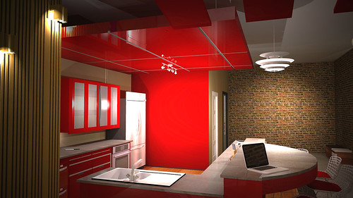
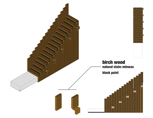
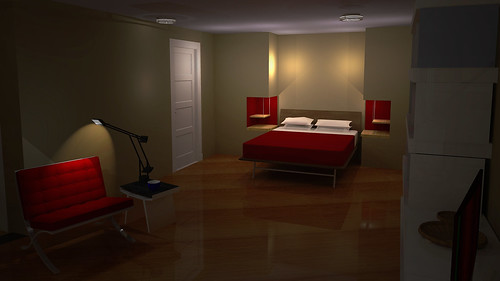
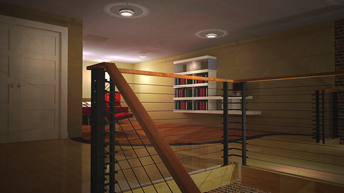
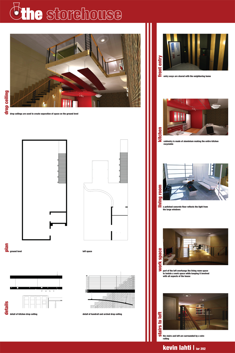
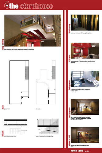
Our final project of Second year was to design a series of open loft homes using a univeristy owned warehouse. The homes had to fit in a footprint within 900 square feet and should feature sustainable ideas and materials. My design took to a very contemporary approach, with a loft I thought the best solution would be then to have very few walls sepearating spaces but I still wanted to give some kind of separation, so materials and textures were chosen to mark these changes. The floors were largely concrete with certain areas given bamboo flooring to mark out those spaces, this was noticable in the kitchen and in the loft if self. On the cieling drop cielings are used to show these changes in space with a large drop over the kitchen while 3 smaller arched cieling fixtures mark the transition into the living space. To mark leaving the public areas of the home the stairs use a series of 1x3" boards layered with each one alternating between a natural stain and a black paint.
These stairs created a nice statement in the space they inhabited and gave good transition from the concrete metal and brick public spaces to the wood private space.
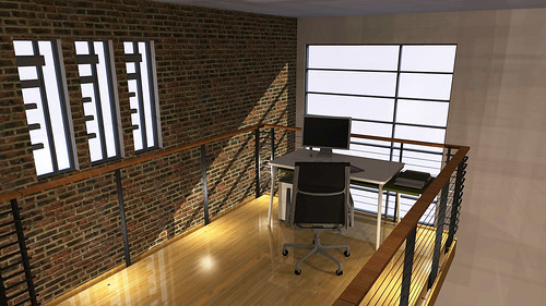
Upstairs in the loft their are two main sections the sleeping space and an outcrop which in this case has been designed as a home office. The outcrop was designed to seperate the occupant physically but still give them a connection as they can view all around them down into the public space or up in the loft space. It is both isolated and yet integrated with what is around it. the floors up here are made with bamboo flooring in two stains spice and natural.
In order to keep the occupants from falling their is a railing going around the perimeter of the loft. The design of this sticks with the contemporary feel I was trying to establish and is very industrial, not to mention recyclable thanks to its aluminium construction.
06 March 2009
Celestial: A place to bathe

With spas and health clubs becoming increasing staples of contemporary society in addition to the growing universal design fundamentals it was only a matter of time until both ideas combined. This design is for a bathing space that can be used by both the able bodied and those who may be bound to wheelchairs. The space itself is divided, one being a more private pool with extra attention from attendants. This is designed for those who may need extra help, are embarrassed or simply seek a little privacy.
The larger pool located, opposite a partition wall is intended for 5 or 6 and also features accessibility to those in wheel chairs. However sitting in a pool in a wheel chair is hardly therapeutic and this space encourages one to leave the chair, to float or simply soak in the water.

Looking up towards the ceiling reveals a series of elevation changes marked with blue undersides, this form is an abstracted idea of water falling and encourages thought with its simplistic pattern.

Light is prevalent in this space with large windows allowing views to the outside but also allowing in much needed light which gives extra character to the space from the shadows cast.

The perspectives from the water may seem limited but they actually direct the view upwards either out the windows or towards the ceilings extrusions.

Attendants will be present at the bath to assist those in need of assistance but will also leave those seeking independence to do so at the guests discretion. With a single entry into the baths via the ramps it eliminates the implied segregation of those who are in wheel chairs and those who are not in addition the fact that the user leaves the wheelchair they may be bound to also removes that segregation.
Below are various drawings including the plan view, ceiling plan, wall section and elevation.


01 March 2009
A Place to dine

My most recent studio project was to create a place to dine in addition to the table present in the space. My table balances itself delicately on one leg. The room itself is very inspired by the bauhaus movements and the international style which I felt related to the tables design.
28 January 2009
Design Manifesto
Design to me as always been about creating something sculptural that attracts the people to it in some way and encourages thought. Much of my design also incorporates a playful use of light. My design attempts to evoke an emotion through its features, these emotions vary depending greatly on what aspect the design is observed. By using light I want to use it to create different effects, which can be reflected upon and are never quite the same. This way the design is constantly changing and constantly creating new emotions for people to experience. Through repetition I create a sense of uniformity but by adding minor differences to each they each gain individuality to better reflect the diversity of the world in which we inhabit. Whether or not my design succeeds is left to the individual but as of now this is what I pursue when I design.
-Kevin Lahti 28/01/2009
Inspiration:
Tadao Ando: Architect
Creates monumental buildings and sculpts the spaces within them and also uses light to emphasize areas. Few erroneous details, all things serve a purpose either aesthetically or structurally, no one element may be removed and have the same emotion left.
Jonathan Ive: designer of the ipod
Elegant sculpture that maintains function in all aspects, nothing erroneous. A uniform device that is individualized by the user. Not well known but product is used everywhere and is one of the most recognizable items in the world.
-Kevin Lahti 28/01/2009
Inspiration:
Tadao Ando: Architect
Creates monumental buildings and sculpts the spaces within them and also uses light to emphasize areas. Few erroneous details, all things serve a purpose either aesthetically or structurally, no one element may be removed and have the same emotion left.
Jonathan Ive: designer of the ipod
Elegant sculpture that maintains function in all aspects, nothing erroneous. A uniform device that is individualized by the user. Not well known but product is used everywhere and is one of the most recognizable items in the world.
10 October 2008
Bus|Shelter
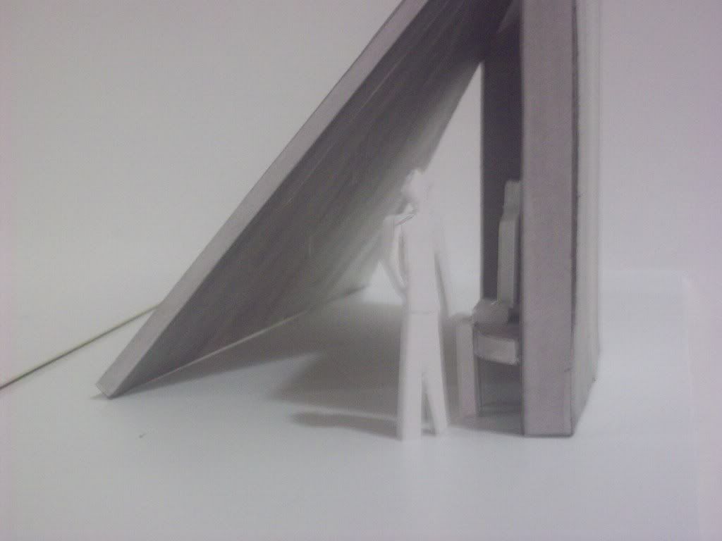
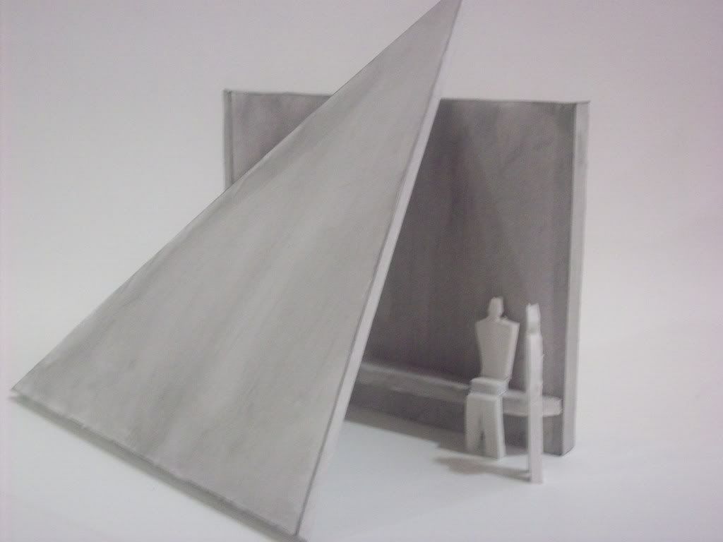
Having concluded the latest charette in our bus|shelter and shelter|bus community design project. I present to you my bus shelter from start to finish. Given my site out side the weatherspoon art gallery I knew I immediately wanted it to relate and therefore I thought it should be sculptural, this led to a series of forms which I played around with.


I was inspired by the architect Tadao Ando who uses concrete and light to create interesting effects using a very minute amount of material, I came to the conclusion that I would use concrete while using light as a focal point of some kind. Taking inspiration from the Ectasy of St. Teresa by Bernini I found a phenomena of light called Zodical Light in which a wash of light goes up into the sky to a very fine point. I decided that this would be the effect that would recreate with my design.


With my concept and ideas I began to build my model


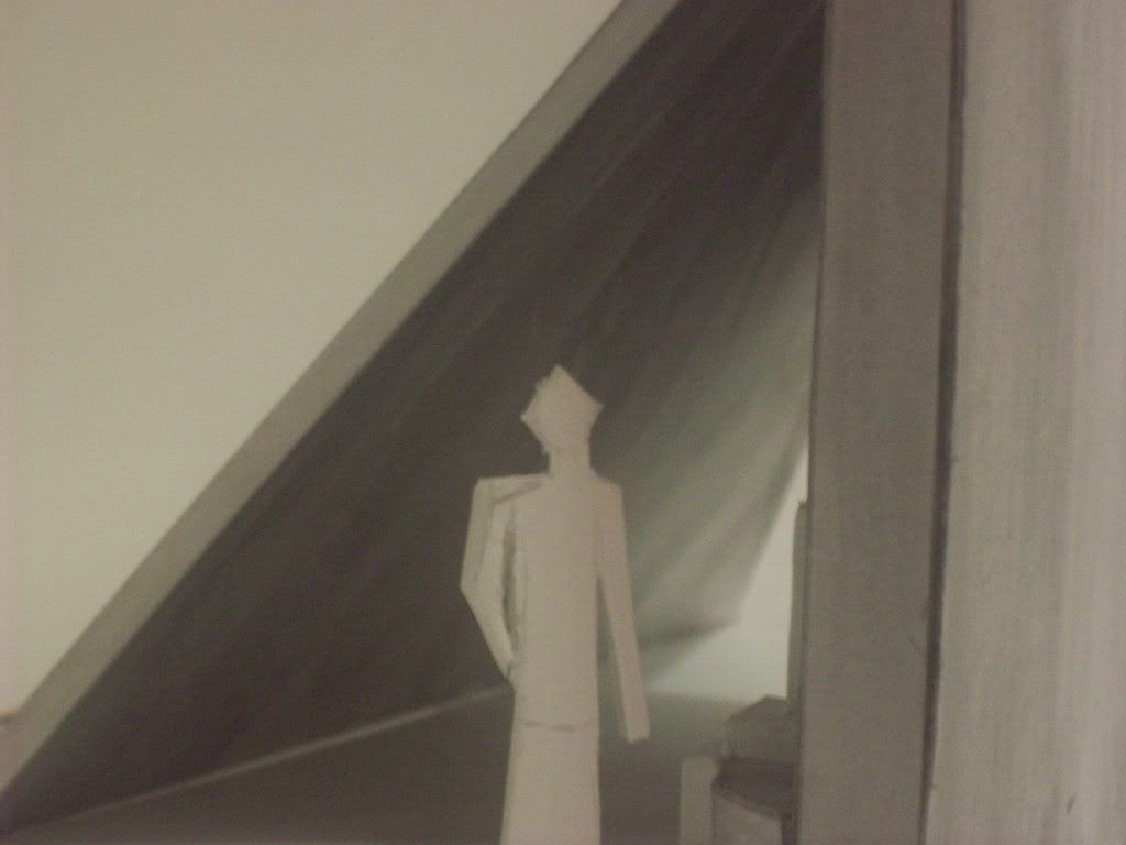
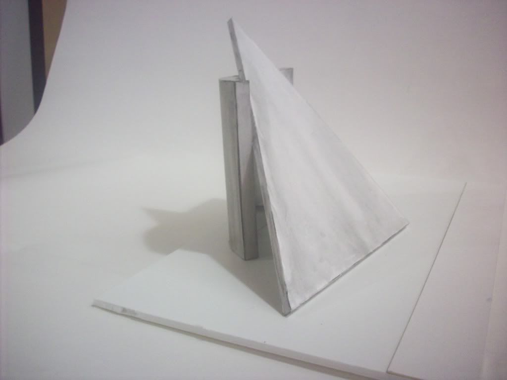
As you can see I took a very modern approach with a bit of minimalism as I wanted the form really to be what attracted the people. On the interior of the triangular wall are a series of glass prisms that will reflect the light and recreate the effect of the Zodiacal light.

These details illustrate a few of the minor details but are important none the less. One shows how the shelter is secured so it will not collapse or fall over the other shows how to keep the glass protected from the concretes expanding and contracting in tempreture changes.
Finally I prepared a contextual illustration of the bus shelter as it should appear in its site.


I was inspired by the architect Tadao Ando who uses concrete and light to create interesting effects using a very minute amount of material, I came to the conclusion that I would use concrete while using light as a focal point of some kind. Taking inspiration from the Ectasy of St. Teresa by Bernini I found a phenomena of light called Zodical Light in which a wash of light goes up into the sky to a very fine point. I decided that this would be the effect that would recreate with my design.


With my concept and ideas I began to build my model
As you can see I took a very modern approach with a bit of minimalism as I wanted the form really to be what attracted the people. On the interior of the triangular wall are a series of glass prisms that will reflect the light and recreate the effect of the Zodiacal light.

These details illustrate a few of the minor details but are important none the less. One shows how the shelter is secured so it will not collapse or fall over the other shows how to keep the glass protected from the concretes expanding and contracting in tempreture changes.
Finally I prepared a contextual illustration of the bus shelter as it should appear in its site.
Labels:
architects,
charette,
Design Research,
iar 201,
markers,
Studio
17 September 2008
Container Charette
My Group decided to focus for our charette for a shelter bus on shelter and Medical Care. I was more interested in the Medical Care aspect so I was really involved in that design. We selected a bus made by Motor Coach Industries due to its size and various modifications they allow to be preformed while the bus is actually being produced. Below are some renders and photographs of some of the work of this charette.

Our idea focuses on literally a mobile hospital complete with triage, phramacy, couciling, an ambulance and even an operating room.

A break down of the space from a plan view, the operating room is in the back and is located near the medicines of the pharmacy, this operating theatre is designed for common surgical procedures.

A perspective view of the operating theatre.

Since we anticipate that people will likely need access to counciling we added a design for a councilng center and doctors private office so that, doctors may have a space for administrative duties but will also have a private place where a counselor may help those who need counseling get the help they need.

A side view of the bus shows the division of the surgical section from the office.

An idea we enjoyed was the idea that their should be some kind of vehicle that could be dispatched to retrieve those people who were unable to make it to the bus. We were able to actually find a bus that had enough space to store a small vehicle as well as the tents needed to set up the recovery and triage area

The bus/hospital after everything is set up, the tent on the right represents a recovery and triage area where a multitude of paitients can be kept until they can be released. The Bus takes on a headquarters roles in a disaster situation in which only the major operations need take place while giving the resources to the doctors and nurses who work to help those who need it.

A plan view of the entire complex once fully set up, this sketch was actually a jumping off point for the whole unit. Heather Link worked with me on the medical bus and she has some more information present on our design on her blog.
Our second bus was literally catering to sheltering victims of a hurricane and that information can be found at Katie Reynolds blog as well as Kara Petrisko's blog.


Our idea focuses on literally a mobile hospital complete with triage, phramacy, couciling, an ambulance and even an operating room.

A break down of the space from a plan view, the operating room is in the back and is located near the medicines of the pharmacy, this operating theatre is designed for common surgical procedures.

A perspective view of the operating theatre.

Since we anticipate that people will likely need access to counciling we added a design for a councilng center and doctors private office so that, doctors may have a space for administrative duties but will also have a private place where a counselor may help those who need counseling get the help they need.

A side view of the bus shows the division of the surgical section from the office.

An idea we enjoyed was the idea that their should be some kind of vehicle that could be dispatched to retrieve those people who were unable to make it to the bus. We were able to actually find a bus that had enough space to store a small vehicle as well as the tents needed to set up the recovery and triage area

The bus/hospital after everything is set up, the tent on the right represents a recovery and triage area where a multitude of paitients can be kept until they can be released. The Bus takes on a headquarters roles in a disaster situation in which only the major operations need take place while giving the resources to the doctors and nurses who work to help those who need it.

A plan view of the entire complex once fully set up, this sketch was actually a jumping off point for the whole unit. Heather Link worked with me on the medical bus and she has some more information present on our design on her blog.
Our second bus was literally catering to sheltering victims of a hurricane and that information can be found at Katie Reynolds blog as well as Kara Petrisko's blog.
Labels:
collaboration,
Design Research,
iar 201,
Ink,
markers,
Studio
28 April 2008
Crit Week 2 the revenge of the crit
ITS CRITIQUE WEEK! The week when all the studios gather to judge everyones projects and make judgments to our own beliefs on our designs. Its also a great time to draw, especially when you need practice drawing people.. Big Crowds lots of overlap, it can get hectic (the drawing not the critiques. I got a few good drawings done today, one involving trying to fit everyone in my view into my space on my sketchbook.. I think I was moderately successful..
I think next time I will try to make the people fill up the whole page, just to give those who are reading this the sheer scale. There were probably close to 100 of us in our little tiny critique room. The rain was overpowering our presenters today, it was actually kind of funny, we had to stop for 10 minutes while we waited for a lull in the rain.
Just look at all those people, I myself am impressed with my effort you can really tell that their are alot of people between me and the projects being displayed. Certain people keep getting messed up because they kept fidgeting or someone would lean forward and block my view but I'd already be about half way through the person and not wanting to change the image, so I'd wait and then my subject would have moved anyway. Oh well! Still looks good to me
This is Ben Adam's Project, he designed a very interesting space for Rothko. I originally only intended to draw the project, but then the veil covering the stool it was seated upon began to call me, before I knew it the stool was too, and then the wall... and then the shadows so it pretty much became a whole scene, only his board is missing. I've been working with my markers so much I almost forgot how you can show contrast using just your pen, I was so ready to whip out my cool grays. By the way Suzanne I think you'd agree that the shadows were likely a cool gray number 1 today.. maybe a 2 in the darker spots.
In conclusion, now that I've finished my final project I'm happy to say that I reunite myself with my sketch book and have some fun. This year has been odd. I used to be incredibly bored, I'd simply play video games or talk to my friends. Now I love to go out and draw and look at the world around me. But this post has gone on far to long, and that big world is in need of documenting.
I think next time I will try to make the people fill up the whole page, just to give those who are reading this the sheer scale. There were probably close to 100 of us in our little tiny critique room. The rain was overpowering our presenters today, it was actually kind of funny, we had to stop for 10 minutes while we waited for a lull in the rain.
Just look at all those people, I myself am impressed with my effort you can really tell that their are alot of people between me and the projects being displayed. Certain people keep getting messed up because they kept fidgeting or someone would lean forward and block my view but I'd already be about half way through the person and not wanting to change the image, so I'd wait and then my subject would have moved anyway. Oh well! Still looks good to me
This is Ben Adam's Project, he designed a very interesting space for Rothko. I originally only intended to draw the project, but then the veil covering the stool it was seated upon began to call me, before I knew it the stool was too, and then the wall... and then the shadows so it pretty much became a whole scene, only his board is missing. I've been working with my markers so much I almost forgot how you can show contrast using just your pen, I was so ready to whip out my cool grays. By the way Suzanne I think you'd agree that the shadows were likely a cool gray number 1 today.. maybe a 2 in the darker spots.In conclusion, now that I've finished my final project I'm happy to say that I reunite myself with my sketch book and have some fun. This year has been odd. I used to be incredibly bored, I'd simply play video games or talk to my friends. Now I love to go out and draw and look at the world around me. But this post has gone on far to long, and that big world is in need of documenting.
Labels:
Critique,
free time,
iar 102 projects,
Ink,
Other's work,
shading,
Sketches,
Studio
29 November 2007
Studio Safaris
So when I get bored, I get bored hard core and I really needed something to take my mind off all the work I'm doing so yea, I grabbed a camera and started shooting so welcome to the first ever FIRST YEAR SAFARI! So put on your best Steve Erwin Voice your safari hat and follow me! Now just as a reminder please do not feed the Iarc majors, and do not antagonize them, they are all known to attack with drawing instruments if they feel intimidated. VERY DANGEROUSSS!
Here we seemed to have stumbled upon the den of an iARC major but where could be? Perhaps this site has been abandoned.
Oh wait, heres where he must be... on the floor, yes of course, its a known fact that when iARC majors cant use their desks due to clutter they often move down to the floors of buildings or other low lying areas. Watch your step they could be anywhere. Very Dangerousss!
As you can see, iARC majors are masters of camouflage. You cant even the iARC student in the picture but if you look hard enough you might just catch a glimpse of his possible location.
AH HA! at last an interior architect in their natural habitat, and even better we seem to have caught it off guard and it hasnt noticed our presence. Sara is working hard, also on the floor, its a popular kind of place to be, honest!
Ahh now here we have a massive network of multiple iARC dens, the iARC major is a pack creature often forming smaller packs within the main pack. Very Dangeroussss!
iARC majors are kings of the urban jungle as you can see and often like to survey their territory, as you can see their kingdom is expansive and vast.
So I do hope you've enjoyed the Studio Safari, I know I did, I'd like to wager we all learned a little some thing as well. Fantastic
-Cheers for now
So I do hope you've enjoyed the Studio Safari, I know I did, I'd like to wager we all learned a little some thing as well. Fantastic
-Cheers for now
Subscribe to:
Posts (Atom)